In this episode Charlie uses the mathematical theory of outliers to find anomalous money transfers.
Say a researcher is attempting to formulate theories about the way that people move on a particular pedestrian walkway. Our imaginary researcher measures the speed of people at set time intervals and gets as data points the following speeds (all in miles per hour): 0, 2, 2, 0, 2, 3, 1, 2, 0, 2, 3, 1, 2, 2, 2, 17. One of these numbers is not like the others. The 17 mi/hour data point is much higher than one would naively expect to see, simply from the collection of the other data points. Such a data point is termed an
When compiling the data, the outlying data point puzzles our researcher, and she goes back to her notes and realizes that the 17 mi/hr "pedestrian" was, in fact, the only bicycler she saw that day. Situations like this are really the essential part of labeling a data point as an outlier - an outlier indicates that certain assumptions inherent in a model do not hold or that a given theory is not true in a particular situation (here, our imaginary researcher assumed that the only mode of transportation on the pedestrian walkway would be walking or perhaps jogging). Outliers can oftentimes suggest directions for improvements to working models.
Note that in very large samples, a small portion of data points are expected to be far away from the mean just by random chance. For instance, in a normal distribution (a distribution arising from a bell curve), about 4% of a randomly selected sample will not be within two standard deviations of the mean, and about 0.2% of the sample will not be within three standard deviations of the mean. So in a large sample of several thousand data points, a dozen or so of these data points might be more than three standard deviations from the mean, and when plotted, they may seem isolated. However, in this context, these data points are not considered outliers because they arise from an expected amount of variation in the population and they do not indicate that any models or theories have broken down.

There are many different possible causes for an outlier:
In our example above, 17 was obviously an outlier, but what if instead of 17, the maximum value had been 9, or 6, or 5? Would you still identify the extremal value as an outlier? Where does one draw the line?
Another way that the line can be blurred is if there are fewer "normal" data points. In our example above example, there were 15 data points between 0 and 3. What if we had only 3 data points in that range? Would it make the data point 17 stand out more or less? Would you still consider it to be an outlier?
Thus far we have used only subjective judgements to determine if a given data point is labeled an outlier. Such subjective judgements are necessarily a bit fuzzy, and we will have some ambiguity at the dividing line. Before you go on, try to devise a quantitative or algorithmic means of identifying outliers. If you have some trouble, the next section on visualizing data may be suggestive.
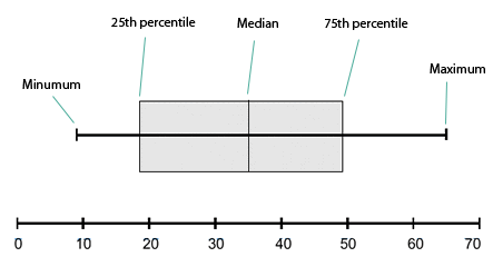
One way to visualize data is a
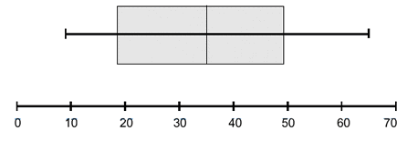
In these plots, the vertical ticks, from left to right, indicate, in order, the minimum data point, the 25th percentile, the median, the 75th percentile, and the maximum data point. These are indicated below:
Another way to visualize a set of numeric data points is a histogram. Here, the range of possible data points is partitioned into a finite number of contiguous intervals, and the number of data points in each interval is represented by the height of a rectangle whose base is that interval. By convention, intervals include their left-hand endpoint, but not their right-hand endpoint, so a data point exactly on a number dividing two intervals will contribute to the right interval, not the left. The following is an example of a histogram:

Sometimes choosing how to divide the possible data values into intervals is difficult. The smaller the intervals, the more detail the graph shows about precisely where data points are accumulated. However, smaller intervals also increase the amount of noise in the graph. That is to say that random chance is more likely to make some rectangles larger and some smaller when the underlying population has no such differences. Lengthening the intervals tends to smooth out these random variations.
Most histograms are constructed with evenly spaced intervals. This is to preserve the correspondence between the area of the rectangles and the portion of data points which fall in that interval (when the intervals are evenly spaced, the proportion of the area of the graph that is in an interval is precisely the proportion of the data points that fall in that interval). However, sometimes if there are many data points in a particular region where there is much statistically significant detail and fewer data points in other regions, it can be advantageous to plot a histogram with unevenly spaced intervals. The heights of the rectangles in such graphs are meaningless, and instead the areas of the rectangles retain their correspondence to the number of data points in the interval. The height of the rectangle would be the number of data points in the interval divided by the length of the interval and possibly multiplied by some scaling factor.
Even when the intervals are evenly spaced, the choice of their length can accentuate certain trends or hide others. Consider the following histogram of the number of lost library books at a small university library over the last nine years:

In the above plot there are three intervals with three years in each interval, and it appears that the number of lost books is steadily decreasing. The students are learning to be more responsible! To see more detail on this trend, we plot the same data, but instead dividing into nine intervals, one for every one of the last nine years:

By changing the scale of our plot, we've uncovered a disturbing trend in recent years of an increasing number of lost library books. There are many ways to accentuate the data you want to show or to lie with statistics.
Cumulative distribution plots are superficially similar to histograms. The difference is that the height of a given point in a cumulative distribution plot corresponds not to the number of data points in some interval around a point, but rather to the number of data points less than or equal to that value. Cumulative distribution overcome a major shortcoming of histograms, that of having to make a choice of the sub-interval size.
Roughly speaking, the slope of the cumulative distribution near a point is roughly the proportion of data points near that value. The following is the cumulative distribution plot of the standard normal curve:

A cumulative distribution plot makes some properties of a data set easier to see and makes other harder to see. For instance, it is obvious from the above plot that exactly 50% of the data in a standard normal curve is less than 0. Also, by subtracting, we can see that about ![]() or 82% of the values in a standard normal distribution are between
or 82% of the values in a standard normal distribution are between ![]() and
and ![]() .
.
Given a data set, define the following variables, called the quartiles:
The four intervals ![]() ,
, ![]() ,
, ![]() , and
, and ![]() , called the quartiles, each contain roughly one quarter of the data points. The interval
, called the quartiles, each contain roughly one quarter of the data points. The interval ![]() contains about half of the data points, and it contains the most central half. The length of this interval, the distance
contains about half of the data points, and it contains the most central half. The length of this interval, the distance ![]() , called the inter-quartile range, is a good measure of how spread out the data points are while remaining immune to change as a result of extreme values.
, called the inter-quartile range, is a good measure of how spread out the data points are while remaining immune to change as a result of extreme values.
Choose some constant factor ![]() . Then we can define points as being outliers if they are more than
. Then we can define points as being outliers if they are more than ![]() greater than
greater than ![]() or more than
or more than ![]() less than
less than ![]() . Equivalently, outliers are points that are outside the interval
. Equivalently, outliers are points that are outside the interval ![]() . The choice of
. The choice of ![]() is entirely subjective, but for many applications
is entirely subjective, but for many applications ![]() is used. However, depending on the context, values from
is used. However, depending on the context, values from ![]() to
to ![]() might be reasonable. Why wouldn't
might be reasonable. Why wouldn't ![]() or smaller be a reasonable constant factor to use?
or smaller be a reasonable constant factor to use?
Unfortunately, the interquartile range method of identifying outliers is a rather blunt instrument and has some very serious liabilities. In many types of populations, the variation that we see in a measured quantity comes from myriad small factors. Based on random chance, most of these factors cancel each other out, and what does not cancel out and is left over is the observed variation of the sample. Rarely, there are samples where more of these factors do not cancel each other, and these samples correspond to extreme data points. These data points, while possibly very extreme, are not outliers in the sense that they do not represent an error in measurement or a distinct paradigm or theory governing that sample. These extreme values are a legitimate part of the population and very likely should not be thrown out in a statistical analysis. We obviously need more refined methods to identify outliers.
Chauvenet's Criterion is a partial answer to the fundamental problem of the interquartile criterion for outlier identification. This method of identification attempts to take into account precisely how unlikely a given data point is, making some reasonable (though not universal) assumptions about the underlying distribution of the population.
The assumption underlying this criterion is that the population is normally distributed. To execute the test, one first calculates the mean and standard deviation of the sample. To test if a particular extremal value is an outlier, one calculates the probability that, given a normal distribution with the same mean and standard deviation, a randomly selected data point would be that far away from the mean or farther. This probability is multiplied by the total number of data points in the sample. If the resulting product is less than ![]() , then the point is deemed an outlier. This extreme data point is eliminated from the sample, and the test is repeated with one fewer data points.
, then the point is deemed an outlier. This extreme data point is eliminated from the sample, and the test is repeated with one fewer data points.
If the underlying population distribution differs from normal, then Chauvenet's Criterion can give false positives or false negatives. If the actual distribution has greater kurtosis (the fourth standardized moment about the mean) than a normal distribution, then Chauvenet's criterion will identify these extreme data points as outliers, when in fact they are unremarkable points. If, instead, the distribution has a smaller kurtosis than a normal distribution, then Chauvenet's criterion will tend to fail to identify potential outliers.