In the course of doing the sanity checks of our data we looked briefly at data sumaries available in DataDesk. The summary values of mean and standard deviation are a pair of values which often provide an excellent numerical summary of a data set. DataDesk is excellent for data exploration, however, precisely because of its facile handling of graphical representations of data. It is often very solicitous about presenting you with analyses or graphical presentations which may not have occurred to you.
Select one of the months from the NOAA data and plot a histogram. Now select another of the month icons and drag it to the label on the horizontal axis of the first histogram. Datadesk immediately plots the new histogram with the data from the new icon. Try setting the scale of the histogram so it remains constant as you plot one histogram after another rather than the default rescaling based on the particular data set.
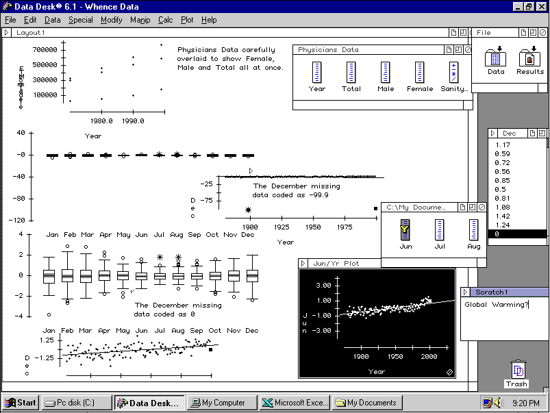
Select the January and February icons from the NOAA data set and produce side-by-side boxplots. Now drag each of the other month icons to the graph in turn. Note that DataDesk adds the boxplot of the new data icon to the existing graph. What happenned when you added December to the presentation? Oops. That mising data value has returned to haunt us. Open the December data values and scroll down to the last one. What might we use as a more neutral value? We are making something up here, but we do actually know some important things about the data over all. The average value is zero so if we change -99.9 to 0 we will have a value which does not so wildly affect our ability to examine the rest of the data. Change the -99.9 to 0 and update the box plot presentation.
Open the Physicians Data and Select Total as the Y-Variable and Year as the X-Variable and then Plot -> ScatterPlot. This gives you a graph of Total Physician population as a function of time. Grab the Male icon to the Total label on your plot and drop it there. Voilà! You now have a graph of Male vs. Time. Do the same with Female. Note that the scale changes dramatically. Set the scale so it is no longer automatic and you can easily explore the changes in physician populations with time on the same scale.
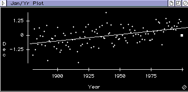
Open the NOAA data, and make a scatterplot of January temperature anomalies over the years (January as the Y variable, Year as the X variable). Add a regression line and drop the various icons for successive months onto the Y-axis. Plot December and note where the zero value we put in appears on the far right of the graph. Was zero a good guess? Does the graph suggest another value you might use instead? From the regression line, we might consider a value somewhat higher than zero. [An update to the NOAA page has shown the actual value to be 0.16]
Create a new layout and copy some of your graphs to the clipboard and paste them into the layout. You can also create new scratchpads with commentary and add them to your layout by copying and pasting their contents.